
Apparel E-Commerce Purchase Experience Redesign
Duration: 12 months; Role: UX Lead; Team: 2 Buy Designers, 3 Design System Designers, 1 Copywriter, 3 Product Managers, 3 Developer teams; Platform: Web
The Challenge
Gap's purchase experience suffered from incremental changes made over time that resulted in an inconsistent user experience. Key problems included:
Inconsistent UI throughout the Purchase journey - Different visual patterns, button styles, and layout of elements created a fragmented experience
Confusing error messaging - Some text inputs were using inline validation that prematurely flagged the content as invalid as the user was still typing
Redundant copy - Repetitive content cluttered the interface
Outdated tech stack - Legacy platform limited performance
Outdated look and feel - The visual design no longer reflected modern user expectations
These issues were impacting user confidence and conversion rates throughout the purchase funnel.
The Solution
I led a comprehensive design audit and rebuild of the Bag, Checkout and Order Confirmation pages. Then established a unified cross-brand design system using Figma variables. The team created components from simple (buttons, inputs) to complex (Payment, Fulfillment selection) that worked seamlessly across Gap's multi-brand purchase experience.
Results
Bag to Checkout visits increased 3.1% - More users progressing from cart to checkout
Bag conversion increased 0.2% - Higher completion rates from shopping bag
Conversion Rate increased 0.2% - Overall improvement in purchase completion
Net RPV (Revenue Per Visit) increased 1.3% - Direct bottom-line business impact
Organizational Impact: This project established foundational design patterns and a working process that influenced Gap's broader design system approach.
Before: Purchase flow for a signed in shopper.
After: Purchase flow for a signed in shopper.
-
As UX Lead, I guided the design strategy and cross-functional collaboration for this redesign. My responsibilities included:
Leading comprehensive audit process - Directed the team in auditing existing components to identify inconsistencies and gaps
Defining new design foundation - Guided the creation of a cohesive design theme and component library for the purchase experience
Strategic prioritization - Led cross-functional discussions to prioritize enhancements based on user impact and technical feasibility
Documentation and requirements - Ensured all edge cases, user scenarios, and business logic were thoroughly documented and supported in the new design
Team coordination - Mentored designers through the design process while collaborating closely with PM and developers
Quality assurance - Maintained design consistency and user experience standards across all touchpoints
-
Current State Analysis: Through a comprehensive audit of the existing purchase experience, our team uncovered significant inconsistencies that were fragmenting the user journey.
Key Audit Findings:
Component Inconsistency: Complex components that appeared across every page of the purchase path (Bag, Checkout, Order Confirmation) had different typography styles, colors, and order of elements
Lack of Standards: No unified design system governing purchase interactions
UX Debt: Legacy implementations had accumulated over time without systematic oversight
Design Challenge: The audit revealed that users were encountering a different interface design language at each step of their purchase journey, undermining trust and usability.
-
Design Theme & Strategy: I led the team in developing a cleaner, more modern visual approach that took a generic cross-brand strategy. This was crucial since Gap's checkout experience supports mixed-brand shopping (Gap, Banana Republic, Old Navy, Athleta), requiring a cohesive system that didn't favor any single brand identity.
Component System Development: Working closely with my design team, we systematically defined every component needed for the checkout experience:
Atomic Components:
Buttons (primary, secondary, tertiary states) and links
Text inputs, text area inputs, dropdowns with consistent styling and error states
Radio buttons and checkboxes
Typography hierarchy and composed text styles
Color palette
Complex Components:
Payment Selection: Credit card, PayPal, ApplePay, AfterPay and gift card options
Fulfillment Selection: Ship to address, Ship to UPS access point, store pickup, and delivery options
Address Forms: Standardized shipping and billing address collection
Promos and Rewards: Promo code application, application of rewards points
Order Summary: Consistent item display, pricing breakdown
-
Cross-functional Partnership:
Worked closely with Product Management to prioritize features and define technical requirements
Collaborated with multiple Engineering teams to identify backend service needs for new components, and to sequence what would be built in each sprint.
Worked with Design System UX Lead to coordinate tasks and clarify responsibilities between designers.
Design System Innovation: This project piloted Figma variables to support future brand theming across the web experience, establishing patterns for a cross-brand theme.
Project Challenges & Solutions: This initiative presented unique organizational challenges that required adaptive leadership:
New Design System Team: The project required rapid team building and process establishment
Undefined Roles: Navigated ambiguous role definitions by clearly establishing responsibilities and communication patterns across design, product, and engineering
Compressed Timeline: Managed an aggressive timeline by strategic prioritization and parallel workstreams
Legacy System Integration: Addressed technical constraints by defining new backend data requirements and coordinating priority alignment with engineering teams while simultaneously developing UI components
-
Design System Limitations: While Figma variables provided a foundation for cross-brand theming, we discovered they were too limited for brand expression in browse experiences where pages need stronger brand differentiation
Cross-Platform Alignment: The success of this web checkout redesign highlighted opportunities for consistency across platforms (web and native mobile app)
Organizational Readiness: Launching design system initiatives requires clear role definition and dedicated development resources from the outset
-
Broader Organizational Impact
Design System Direction: Our component library and Figma variables approach influenced the overall direction of Gap's design system strategy
Cross-Platform Initiative: The success of this work directly led to a new initiative to align Buy path UI consistency across web and native mobile applications
Process Improvements: Established patterns for cross-functional collaboration on complex design system projects that are now used across other initiatives

Cross-brand theme colors included a limited palette of neutrals, blue as an accent for important actions, select colors for status messaging.

Cross-brand theme uses a single font family with defined typography styles. These were translated into Tailwind CSS for developers' use.
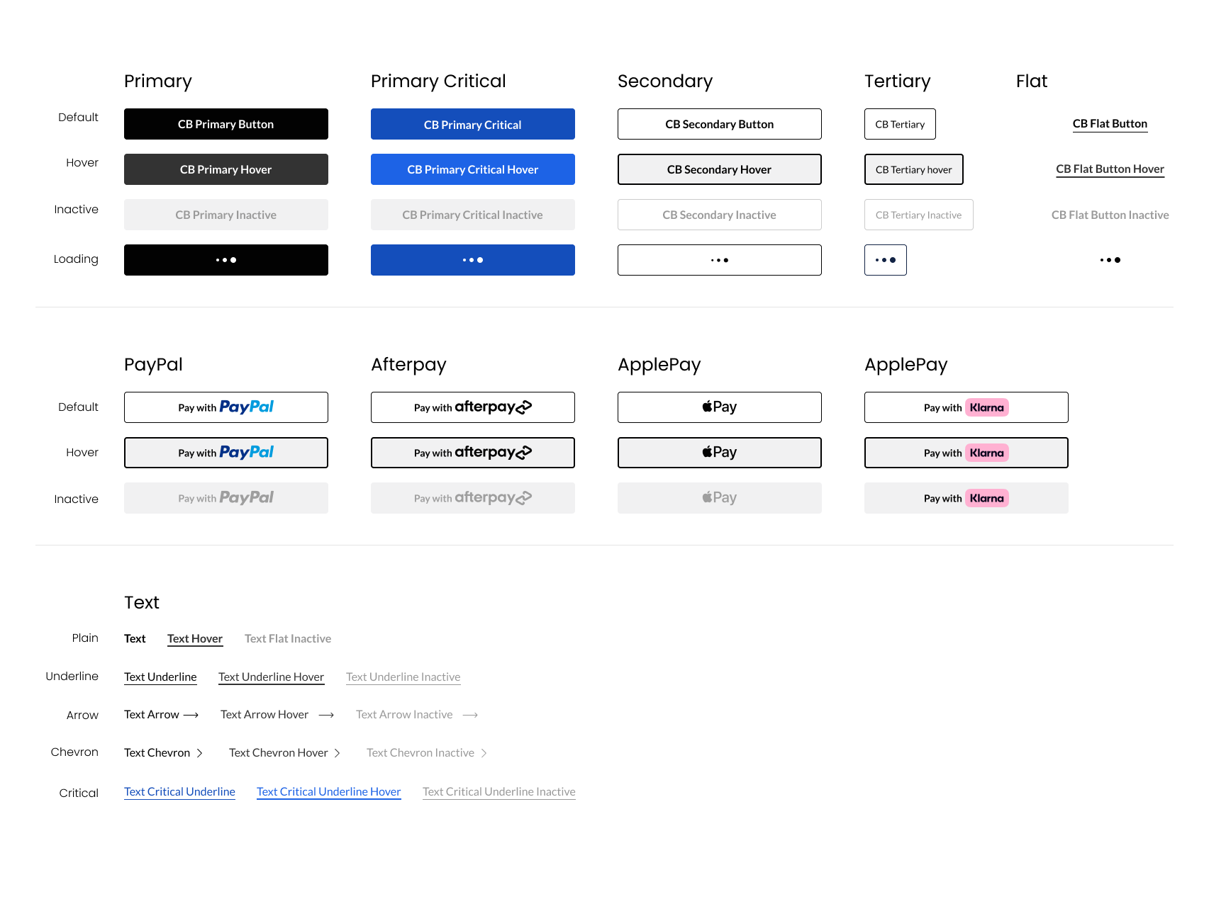
Button - example component variants and states
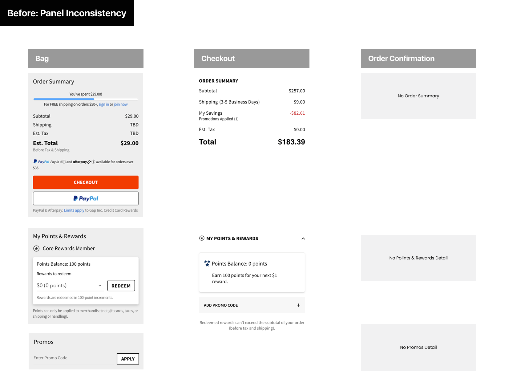
Before: Panels had different background colors, titles had different sizes, weights, and capitalization from page to page.
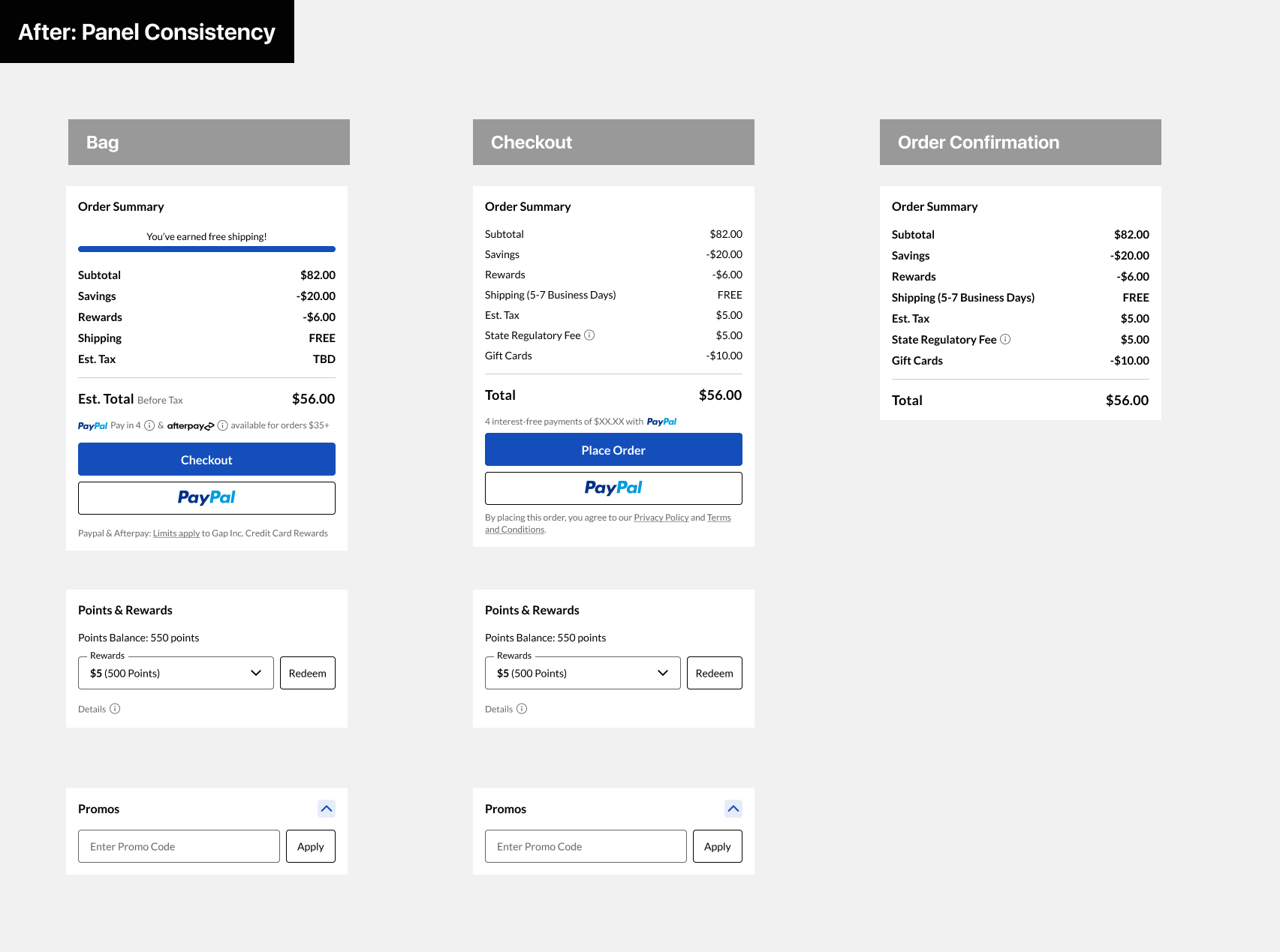
After: We designed each panel for consistency across the purchase journey

This is an example of a component matrix we created for developers that showed various states of the same panel
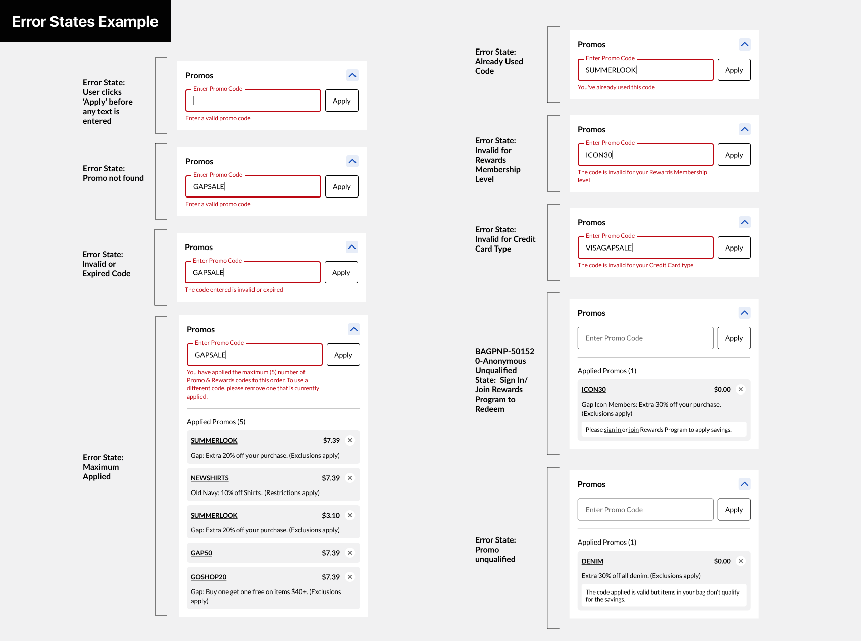
We would also include error states for different scenarios in our documentation for developers

Bag desktop layout

Checkout desktop layout

Order Confirmation desktop layout